All about the new Twitter.com
So if you've been on Twitter over the past 12 hours, you'll have noticed that things look a little different to say the least. The social microblogging service received a major upgrade, packing new functions and an all new design, forming the most significant update of Twitter yet. Here's what has changed both on the face of it and under the hood.
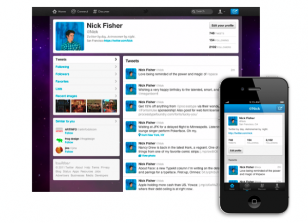
Beginning with where you start, the site interface revolves around four areas: Home, Connect, Discover and Me. Each one is pretty self-explanatory as to what they do, making the navigation around the service easier for the end user.
The looks
The homepage has had a switcharound, with features being placed on the left side and your stream of tweets on the right. Expanded functionality includes the ability to see photos, videos and conversations right inside the tweets via clicking on the particular selection. Basically, the previous 'opening up to the right' has been replaced with a more fluid presentation to interact with.
Connect replaces the implementation on the 'Old Twitter' where all interactions with your profile were catalogued into one section; but it's further expanded with search for other people's interactions via entering their @handle.
Discover is the new #tag search. The page initially loads with popular stories related to your interests, connections, location and languages. From there you can search for other trends, and the algorithm will return results based on these intermediaries.
Me is your profile, only nicer looking, so there's not much point dilly-dallying with this.
For the 'business' in you
Enhanced business use is now in place, as Twitter joins Facebook and Google+ by introducing brand pages. Although the vast majority of companies already have a regular account, these specialist pages allow for a divergent look in comparison to standard profile pages (addition of a banner), further interaction with followers, and the option to promote particular tweets within your own stream (give them the prime space at the top).
Under the hood
 They haven't stopped at a UI overhaul, also looking into the algorithm thatc measures topic trends and selects them for that 'gold medal' position that is the trending column. The alterations come from the ground up, taking many more items into consideration: how relevant the topic is, how new it is, and how sudden the spike of discussion around the trend is.
What does this mean? Well for starters, you'll notice that Justin Bieber isn't a permanent namestake in the trending column (hallelujah) and the trends are more up-to-date (if it wasn't 'live' enough), since the algorithm doesn't prioritise the quantitative results of the trend; but rather the qualitative data. It's going to be an interesting logic to try and take advantage of when the 'next big thing' from #FollowFriday occurs.
Final thoughts
It's stumped the office a fair bit, splitting us into two camps. One side sees this as the great step forward they've always wanted, elevating the network to something much more than the 140 character limit permits it to be: putting the content that's actively shared for consumption in a position that makes it much more 'consumeable.' The other camp are disputing this direction, saying that the previous experience did not deturb you from actually using the network to it's truest worth, and the algorithm will end up ultimately constricting the content people view.
Overall though, the app side of things needs a little tune-up (you can't copy and paste tweets on the iOS version for example); but it does look nice to be honest.
Source: Twitter