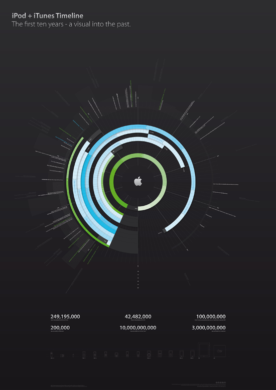
Infographic of the day: iPod and iTunes Timeline
It's true what is said, the transforming of data into presentation can be done to a point that it begins to look like art. This is a prime example of this. Displaying the key items in the timeline of the iPod hardware and the iTunes software which integrated with it. A clock chart iconifies all the key time landmarks, along with a few key facts about downloads and sales at the bottom. An ideal output of the numbers from the Steve Jobs era of Apple products. Thanks Filip Chudzinski!
