
HP rebranding proposition explained in pictures and video
Three years have passed since Moving Brands were hired by HP to redesign the brand imagery through a radical overhaul, and rediscover the identity of the company through improved visual output.
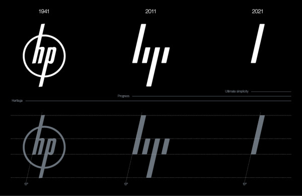
This is the first time we've been able to see the complete proposition in public, and it's quite a transformation. The company have departed from the circlular design and opted instead for a pretty minimalist four-line motif; but they haven't rid themselves of the slant in the lettering. In fact, this 13-degree angle continues throughout everything that HP does: from the promotional material to the hardware, even to the way the box lid is cut to conjoin with the rest of the packaging and the level indicators are presented on the sides of printers.
But, probably the reason why we're not seeing this at HP, this rather bold change to the whole company is one that hasn't been taken on board. To be fair, anything this 'extreme' to the current norm a company resumes is going to get any board member on edge. We just hope that when they're ready for change, they return to these guys. Take a look at their video material below, it's pretty fascinating.
Source: Moving Brands