

New Myspace Review
Myspace has suffered in its position as the 'punch line' to any Social Media humour. Destroyed by News Corporation, then rendered further into obsolescence by a minor reboot and a subpar software integration into TVs. That is until a certain popstar/star in a movie about Facebook took interest, both financially and mentally. The result is what you see, a complete overhaul.
Has this proverbial phoenix risen from the ashes, or have we fallen for good looks with no form and function?
Yet another Spotify competitor?

MySpace always excelled when it came to music. The site was ideal for fans to follow their favourite bans and artists such as Lily Allen, NeverSayNever and Jeffree Star crafted a huge presence on the site. This reboot plays on every bit of success gained in this area. You can connect with many of your favourite artists on the site although whilst still in the beta phase, many pages are simply empty fan sites at the moment. Fans of the more well known acts, such as Lana Del Ray, will see a plethora of photos, music and news updates on her profile. This disconnect should fix itself soon enough.
One thing I really enjoy with the site is the music player. It sits comfortably at the bottom of the screen and provides you with several options of how you want to listen to music or you can hide it away altogether. You can queue individual tracks, listen to whole albums and even make and share playlists. It also creates "radio stations" of similar artists. It all fits really nicely, with the player and messenger at the bottom of the screen as well as several other functions. I can't help but think, however, that it'd be much nicer to have the music player as a constant in your browsing experience.
Switching back to the Myspace tab to change tracks can get mighty annoying, feeling rather archaic to the direct computer integration of other services. To really exploit this key strength of the service, some form of background listening controls are necessary, whether that be through a browser plugin that keeps the player bar constant through all tabs, or the addition of keyboard shortcuts.
So far listening to music is uninterrupted by adverts but I can't be the only one who thinks that this is too good to be true. Already Spotify is losing artists, how does MySpace think it's going to cope in the turbulent streaming industry? The simple answer is to mention the 20+ million songs currently on the service, far more than the current poster-child of music streaming, alongside giving the artist a full page to promote themselves to an audience of music listeners; but the answer will be more complex as time goes by.
Nostalgia
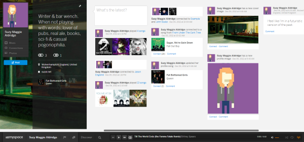
Underneath the gloss of horizontal-scrolling, prominent typography and 'Windows 8'-esque visual style, the Profile seems to boast mostly the same features from before, you can display your Top 8 connections and have an irritating auto-played song. Beyond this, extra fat has been trimmed in the form of dropping its blogging platform, focussing highly on visually (and audibly) engaging content: large cover photos and music.
Though I feel a burst of nostalgia through some maintained features, the profile page can seem rather bland. It seems very focused on displaying a brand rather than a personality. The modular feel of the old MySpace is gone, replaced by a menu where visitors can access the person's connections, photos and playlists. The functionality is certainly present; but lacks that 'chance of self expression' everyone yearns for in their social networking.
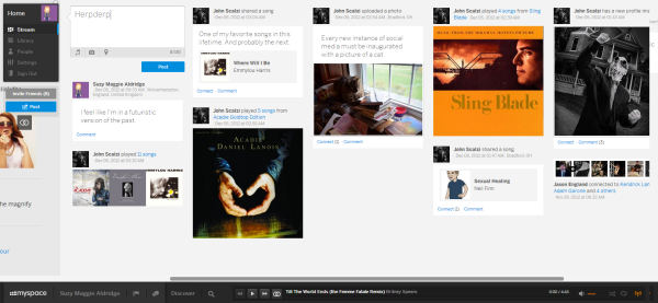
Connectivity
You don't have friends on MySpace any more, you have connections. When you connect with a friend or an artist their activity will show up on your feed. You can share photos, playlists, statuses, links, and the songs you've been listening to. It somewhat seems like Facebook and Spotify had an unpopular baby that is inexplicably horizontal. Yep, the news feed on the New MySpace scrolls horizontally. My first thought was that these was designed more for tablets and touch screen displays however the entire website gets very confused, even with it's minimalist interface, and simply doesn't work on many different forms of user interface, fitting more comfortably towards mobile use instead.
Overall I like the design and the interface of the rejuvenated website but could it just be doomed to the existence that Google+ endures except with the face of an old friend unless miraculously MySpace bucks the trend.
Suzy Aldridge