
The Next Microsoft: Design Student Rebrands The Company
Los Angeles-based design student, Andrew Kim, has presented a comprehensive rebranding plan for Microsoft. Something that he has worked on in the space of just three days.
It's fair to say we're beginning to see a new Microsoft, which is slowly breaking away from their interpretations of conservative thinking and lacklustre innovation. They are beginning to re-envision Windows with their 8th version through improved interaction design, a strikingly visual Metro UI and a pricing strategy which brings it into a much more competitive stance.
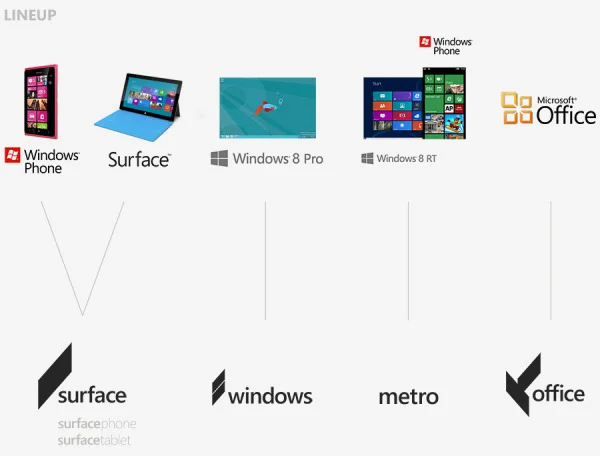
However, the one observation that people don't really make while analysing the company's new presence is probably one of the most important: the logo. How is this presented visually through their brand? Turns out they've introduced a logo which actually evolves the company backwards to their original 1985 logo.
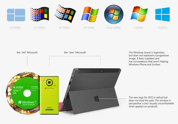
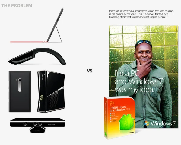
Andrew's main criticism of Microsoft's branding that for all the innovative products they are showing recently, the company has a branding effort which lacks the same message of inspiration they're trying to communicate through their visually defined product designs. The Windows logo, while a key piece of history it may be, doesn't represent a progressive product anymore, and feels rather outdated.
So his solution? Simple. Drop all ties with the past. Windows is a brand that visually restricts and hinders the output of products by the company. So remove the visually repressive windows logo, and just go for what Andrew calls "The Slate." This is what he has come up with.
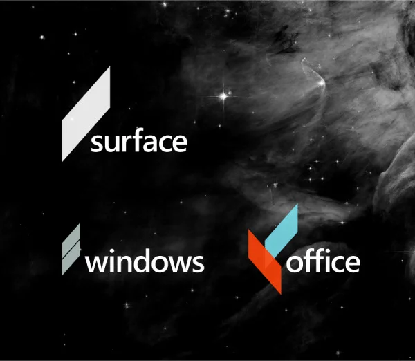
The next Microsoft is built around the belief and passion for the future. Innovation and progress is engraved into the culture and expressed to the public in a bold a mysterious fashion.
I like it. Bold, modern, fits much more into today's trend of brand design. Along with this has come a simplification of the product line, which somehow makes the product sound more appealing within their own market space. This demonstrated initiative by Andrew makes for quite a brilliant output of visual examples, and I implore you all to take a look.
Jason England
Source: Minimally Minimal


Alongside the scientists, 50% of the British public and the future health of young people across the nation, I have one simple request: delay Freedom Day, please.