

Myspace Previews A Ground-up Redesign
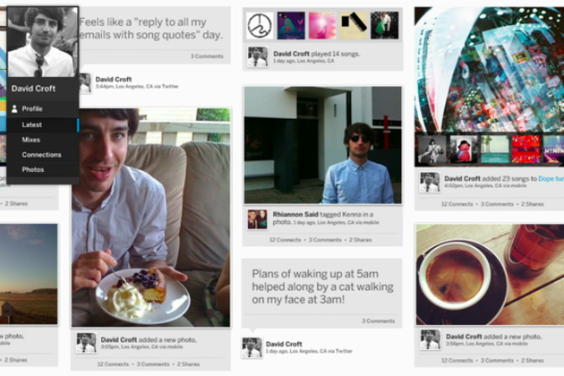
It failed under the leadership of News Corp, and we didn't really hear from them beyond their foray into TV at CES. But Myspace are making a last stand with a complete ground-up redesign. The company have just released a preview of their pretty bold new interface, which seems like a cross between Pinterest, Windows 8 and the tablet version of Google+.
THIS IS MYSPACE t.co/pPKObXyB #NEWMYSPACE
Integration with the more dominant Facebook and Twitter from the start beckons people to "bring their stuff," including videos, photo albums and music playlists (whether this will lead to integration with streaming services such as Spotify is left open to question). As has always been key to the service, music is the key focus yet again, with the persistent controls in the navigation bar, the ability to build playlists within the site and the audio and visual representation of sharing songs and events through photography.
This is all adding up to a rather good-looking service, which (making a prediction) will probably not take off. It doesn't look like it'll do much more than what can already be achieved on the likes of Facebook, and chances are most people will stick to these services rather than add an extra layer onto their social media usage. But this is something I can't pass judgement on without actually using the service. Upon seeing it though the visuals seem fresh and really well designed. It'll probably regain some users who moved on from the early 2000s. Take a look, tell us what you think about the music-social network.
Source: Myspace
Jason England