

Designer creates a typeface to recreate his own experience with dyslexia
Dyslexia makes for some frustrating reading, and to try and explain what it's like to someone can get annoying. Graphic designer Dan Britton knows your pain and has created a typeface to visually simulate his own experience reading text.
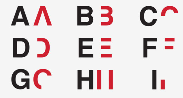
This has been created through taking the standard Helvetica font and removing some key visual characteristics of each letter (the central horizontal line of a letter 'A' for example).
“You can’t skim through, you have to pick out and read each individual letter, then piece together the words, then sentences and paragraphs,” Britton commented on an article in Dezeen. “The whole process of reading is 10 times slower, similar to that of a dyslexic reader, to recreate the embarrassment of reading with everyday type.”